

I built a small web app that turns any image into stylized ASCII art. At first, it was just a simple generic tool. But then I had a better idea.
Instead of keeping it as a regular web interface, I placed the whole app inside an old Game Boy-style device.
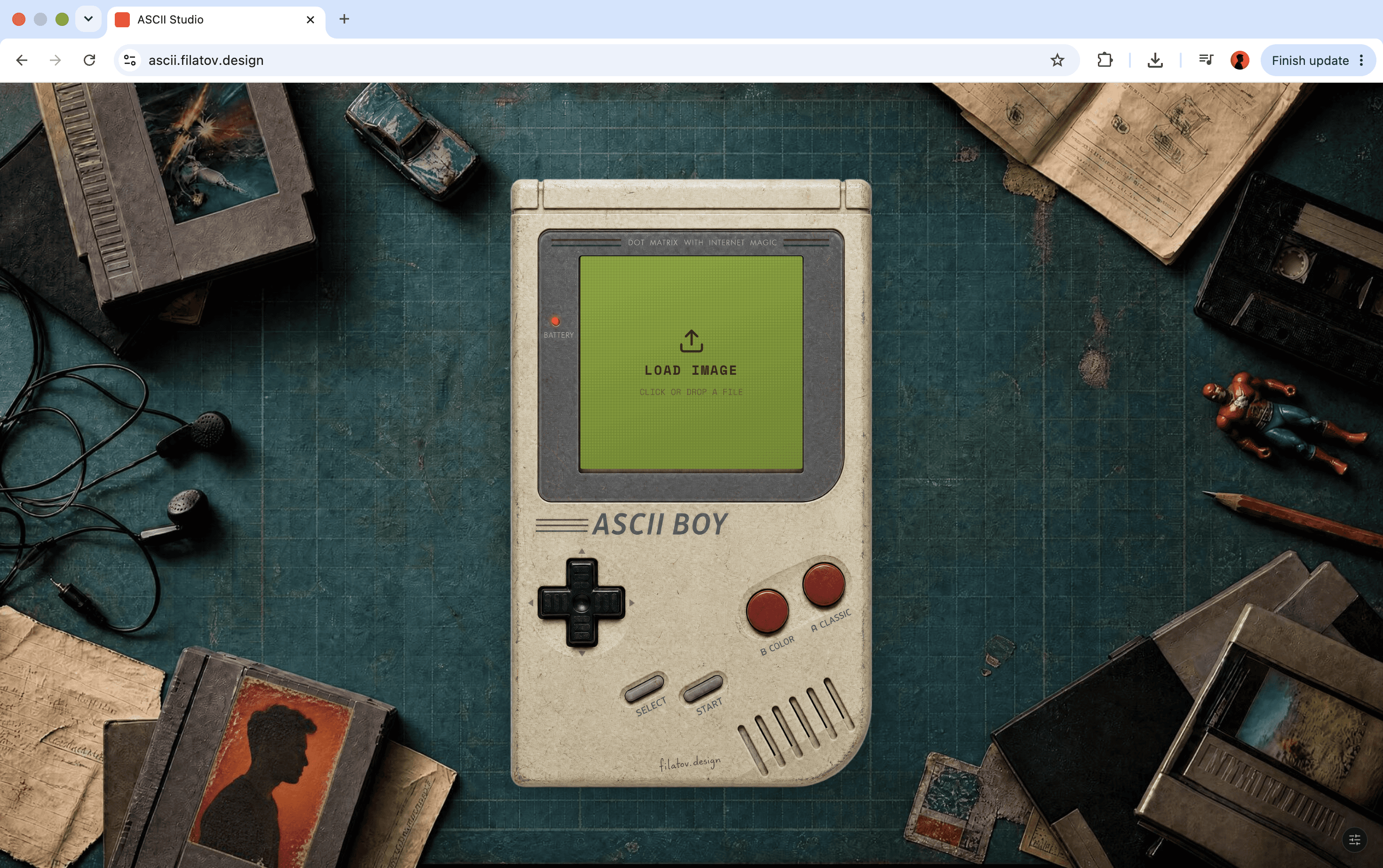
The screen became the upload area.
The red buttons changed the visual style.
The D-pad controlled resolution and contrast.
And the final app was published online with one click.
Here’s the full breakdown.

1. Building the first version
I started in Replit with a simple prompt describing the core functionality.

Starting Prompts
Build a polished web app called ASCII Studio. The app lets users upload an image and convert it into stylized ASCII art. Create: Drag-and-drop image upload. Split layout: original image on the left, ASCII output on the right. Generate and Reset buttons. ASCII conversion based on image brightness and contrast. Style presets: Classic Terminal, Minimal Black & White, Poster Mode, Color ASCII, Cyberpunk. Controls for resolution, character density, contrast, and character set. Poster mode with a title, frame, metadata, and export-ready layout. Export buttons: PNG, TXT, and Copy to Clipboard. Design it as a modern dark creative tool for designers: clean UI, rounded cards, strong typography, smooth spacing, subtle borders, and visually impressive output.
The first version was working pretty quickly. It had the core functionality, but visually it still felt like a normal web tool.
That’s when I decided to turn the interface into something more memorable.
2. Creating the custom Game Boy-style frame
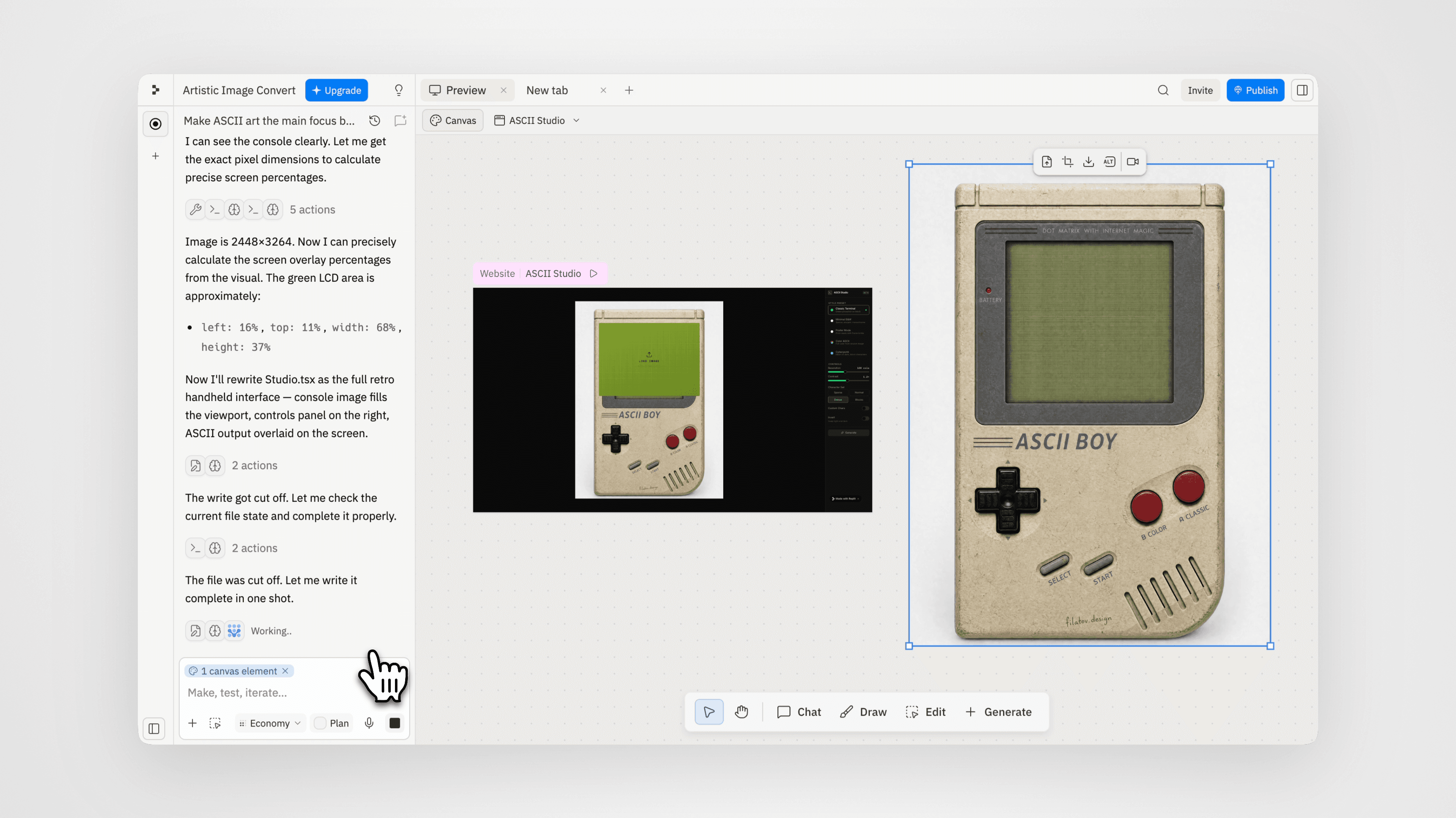
Before changing the app, I needed a visual frame.
I used an old Game Boy reference and generated a fictional, unbranded retro handheld console. The most important part was keeping the screen blank, because I needed to place the real ASCII output inside it later.
Image Generation Prompt
Use the attached Game Boy reference image as the main structural reference, but slightly redesign it into a fictional unbranded retro handheld console optimized for a web app interface. Keep the same nostalgic 90s portable gaming device look: off-white plastic body, dark gray screen bezel, red A/B buttons, black D-pad, Start/Select buttons, and speaker grooves. Make the LCD screen area slightly larger and cleaner than in the reference, while still feeling realistic and proportional. The screen must be completely blank, flat muted green, and perfectly empty, ready for placing custom ASCII artwork inside later.Remove all original branding, logos, labels, and copyrighted text. Do not include “Nintendo”, “Game Boy”, “Dot Matrix”, or any other visible text. Keep only the physical design language and retro handheld feeling. Photorealistic product mockup, front-facing symmetrical composition, centered on a clean light background, generous margins around the device, realistic plastic texture, subtle wear, soft studio lighting, crisp details, clean shadows, high-resolution, mockup-ready. No hands, no extra objects, no screen content, no UI, no text, no logos.
I then attached the image I got and used it as the base for the next edit. I added custom text, small functional labels, and subtle wear to make the device feel more intentional and less like a clean generated mockup. This made the device feel less generic and more like a custom object made for the app.
3. Placing the app inside the Game Boy
Once the device image was ready, I uploaded it to Replit and asked Replit to rebuild the interface around it.
The goal was simple:
The Game Boy becomes the app.
The screen displays the ASCII output.
Clicking the screen opens image upload.
The rest of the app logic stays the same.
Replit Prompt
Transform the current ASCII Studio layout into a full-screen retro handheld interface. Requirements: Remove the current sidebar-heavy layout from the main view. Center the uploaded console image on the page. The console should take around 85–90% of the viewport height on desktop. Keep generous margins around it. Overlay the ASCII output exactly inside the green LCD screen area of the console. The ASCII output must be clipped inside the screen and should not overflow outside it. The screen area should remain the main focus of the app. Clicking the screen should open the image upload flow. After upload, the generated ASCII image should appear inside the screen. Keep the existing ASCII generation logic, presets, resolution, contrast, character set, custom characters, invert, copy, TXT export, PNG export, regenerate, and reset functionality. Only redesign the interface around the new console image. For now, focus only on layout and screen overlay positioning. Do not add button interactions yet.
This was one of the most important steps, because the app stopped feeling like a webpage and started feeling like an interactive object.
4. Turning the physical buttons into controls
Next, I made the physical buttons functional.
The idea was:
Screen = upload image
A button = Classic Terminal style
B button = Color ASCII style
D-pad up/down = resolution
D-pad left/right = contrast
Start = regenerate
Select = reset
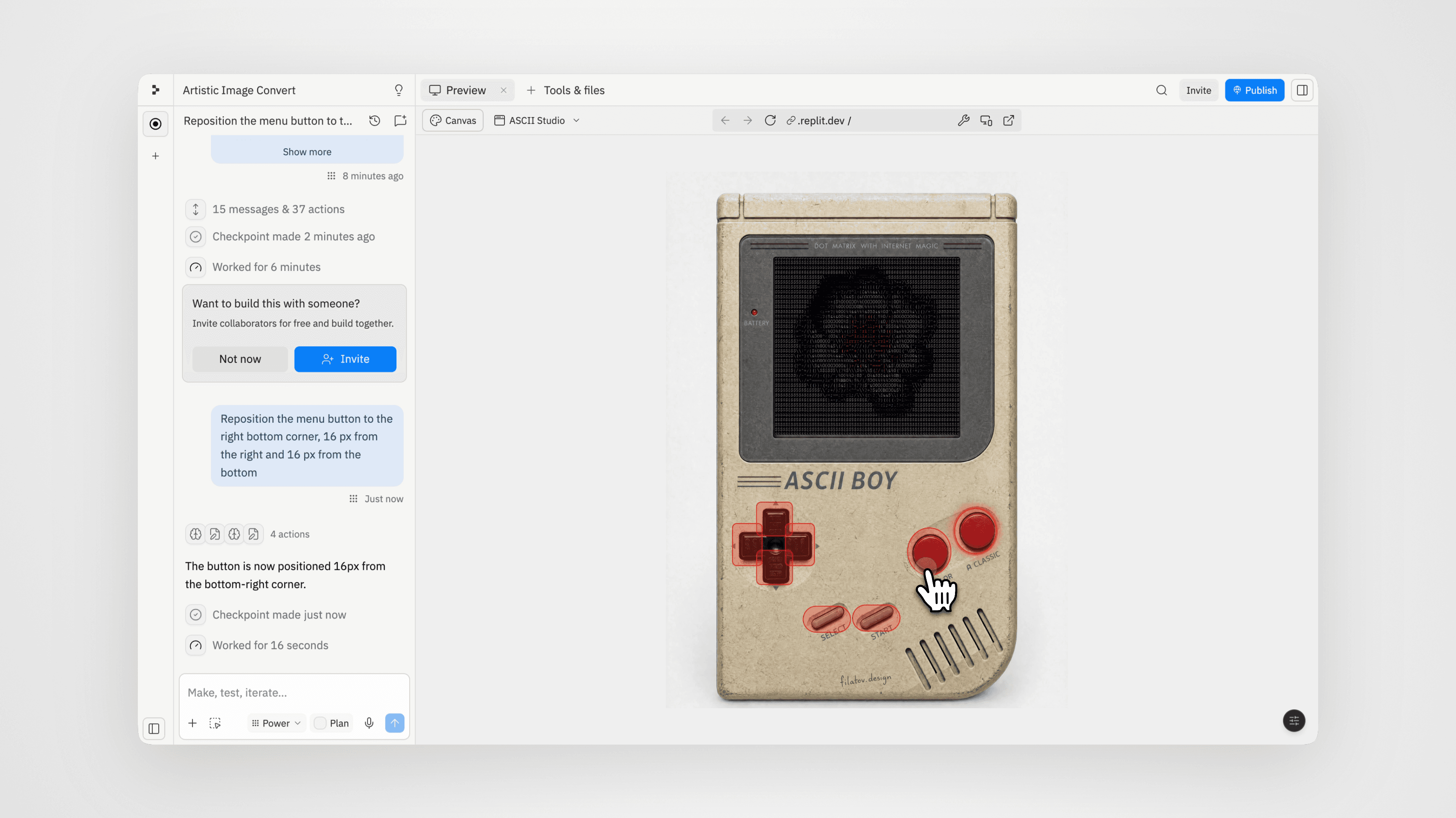
Replit Prompt
Create invisible clickable zones positioned over the console buttons: Screen area: opens image upload. A button (the circle button on the right): switch to Classic Terminal preset. B button (the left circle button): switch to Color ASCII preset. D-pad up: increase resolution. D-pad down: decrease resolution. D-pad right: increase contrast. D-pad left: decrease contrast. Start button: export as png. Select button: invert. Keep the zones invisible by default, but add subtle hover and press feedback: slight glow, small scale effect, soft outline, cursor pointer. Do not add visible modern buttons on top of the device. The physical console itself should feel like the interface.
There were a few refinements during this phase too. I adjusted the screen crop, fixed the button hit zones, tweaked the hover states, and polished a few small interaction details so the device actually felt usable.
5. Cleaning up the interface
The right control panel was useful, but it made the app look less like a real handheld device. So I hid the panel behind a small circular button.
The controls are still there, but they don’t distract from the main experience.
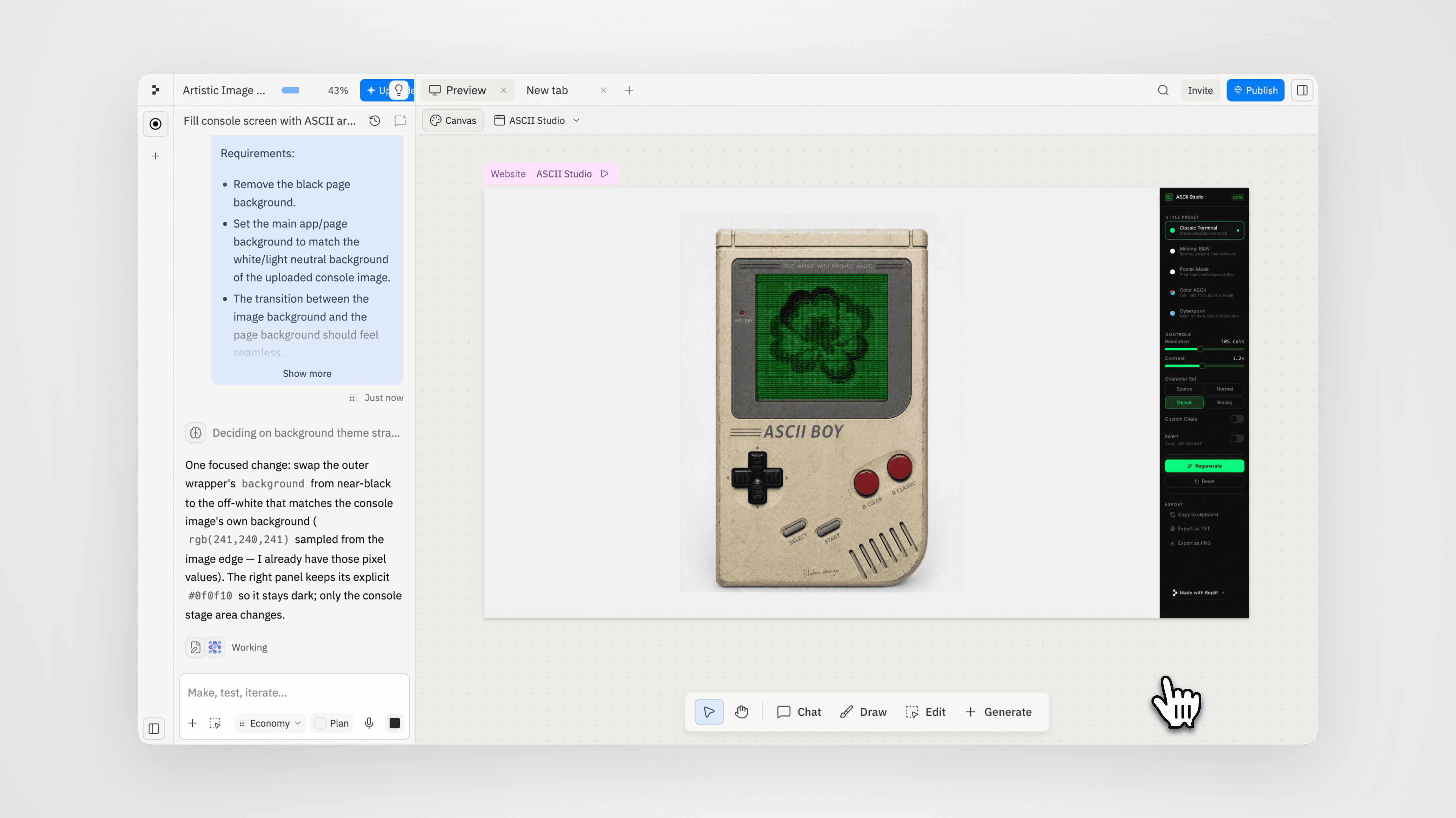
This made the interface feel much cleaner.
6. Creating the retro desk background
Finally, I wanted the app to feel like it belonged in a real scene.
So I generated a top-down background with an old cutting mat, retro objects, cartridges, cassette tapes, wired earbuds, and nostalgic toys around the edges.
The center had to stay clean, because that’s where the Game Boy would sit.
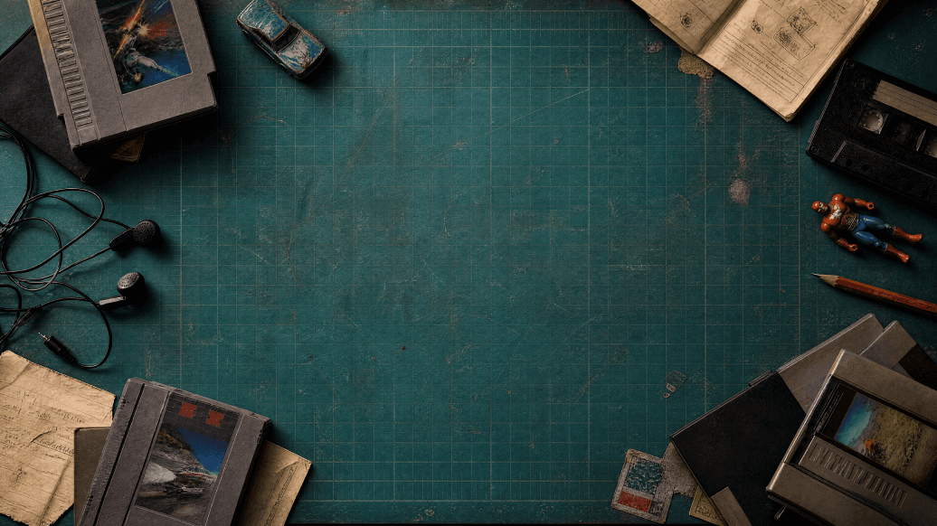
Background Generation Prompt
Top-down cinematic product background of a worn blue-green self-healing cutting mat on a creative desk. The mat has subtle grid lines, measurement marks, scratches, knife cuts, faded areas, dust, tape marks, and realistic worn plastic texture. Warm side lighting, soft shadows, nostalgic 90s maker desk atmosphere. Keep the center area clean and empty for placing a retro handheld console. The center should show only the cutting mat surface and subtle texture. Around the margins, arrange old-school nostalgic objects: gray retro game cartridges, black cassette tapes, tangled wired earbuds, an old worn die-cast toy car, a small generic red-and-blue plastic superhero toy, pencil, folded instruction paper, torn notes, and small faded stickers. Objects should stay near the edges and corners, framing the empty center. Muted teal / blue-green color palette, high contrast for an off-white handheld device, realistic top-down perspective, premium editorial product photography, detailed textures, believable shadows, slightly dusty vintage mood. No hands, no people, no faces, no brand logos, no copyrighted characters, no readable text, no modern objects, no handheld console in the center.
Then I uploaded the background to Replit and placed the interactive Game Boy on top of it. This gave the final app much more depth and made the whole thing feel like a real top-down creative setup.
7. Publishing the app
Once everything worked, I published the app directly from Replit and connected it to my own custom domain.
The final result is a fully functional ASCII art tool inside a custom old-school handheld interface. You can upload an image, turn it into ASCII, switch styles, tune the result with the D-pad, and export it.
The biggest lesson from this project:
You don’t have to stop at the first working version.
Once the core functionality is there, you can keep testing ideas, improving the interface, fixing details, and making the project more memorable.
Start simple.
Make it work.
Then make it fun.
the platform
Each collection is built around a distinct visual language, with reusable prompts, templates, and notes that help you customize fast.


