As a designer, I always have ideas for small tools I wish existed, and this time I wanted to turn one of those ideas into something real:
A browser-based mockup tool where anyone can choose a scene, upload their design, adjust it, and export the final mockup.
The idea
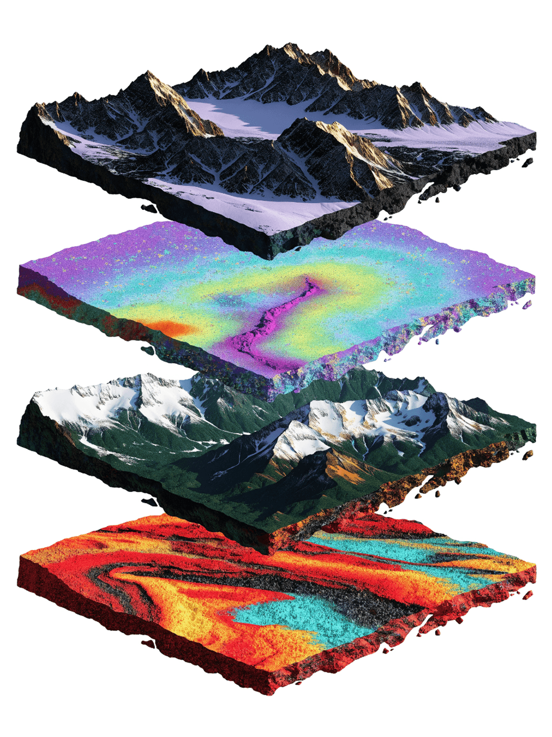
I had a collection of AI-generated mockup scenes. They looked nice, but they were still just static images. So the goal was to turn them into an interactive tool where users could:
choose a mockup scene
upload their own design or screenshot
place it inside the device screen
adjust the position and perspective
fine-tune the look
export the final mockup
Basically, I wanted to turn a folder of images into a real creative tool.
1. Building the first working version
I started with the core functionality first. The goal was not to make the app beautiful right away. I just wanted to see if Cursor could build the basic version of the tool.
The first version needed to let users:
choose a mockup scene
upload their own design
place it inside the device screen
adjust the design position
export the final mockup
Starting Prompt
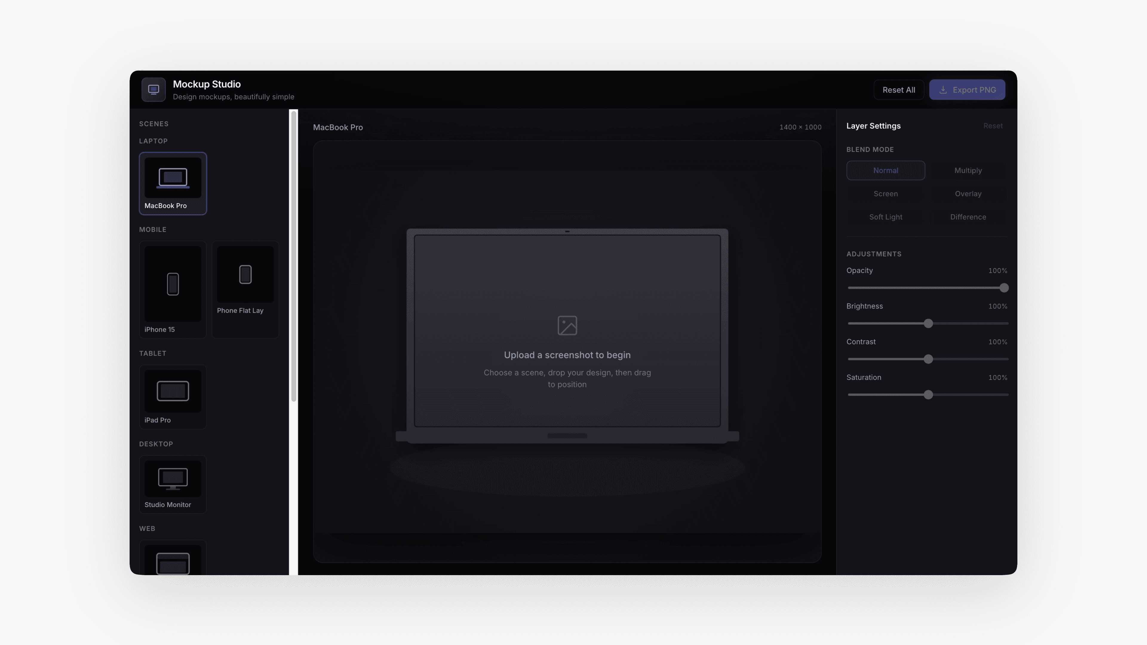
Build a modern web app called Mockup Studio. The app lets users create polished mockup images by placing their own screenshots or designs inside preset mockup scenes. Core functionality: - Create a gallery of preset mockup scenes - Let users upload a screenshot or design image - Place the uploaded image inside the selected screen area - Allow the user to drag and reposition the screenshot inside the screen - Add zoom controls: fit, fill, zoom in, zoom out, reset - Add blend mode options: Normal, Multiply, Screen, Overlay, Soft Light, Difference - Add opacity, brightness, contrast, and saturation controls - Add export button to download the final mockup as PNG Layout: - Left sidebar: preset scenes, upload screenshot, controls - Main canvas: large mockup preview - Top bar: app name, export button, reset button - Right panel: layer settings and blend options Important: - Use a polished dark UI - Make it feel like a premium creative tool for designers - The mockup image should be the main focus - Make the screenshot placement feel smooth and interactive - Preset mockup scenes should have predefined screen areas - If no real preset images are available, create placeholder mockup scenes first and structure the code so I can easily replace them with my own images later
The first result was not polished, but that was totally fine. It had the basic structure, the upload flow, the mockup preview, and enough functionality to prove that the idea could work. That was the main goal of step one: get something working first, then improve it.
2. Adding my own scenes and refining the design
Once the first version worked, I uploaded my own AI-generated mockup scenes into the project. This was the moment where the app started to feel more like my own product instead of a generic demo.
I wanted the tool to feel clean, minimal, and more like a polished creative editor, so I created a simple layout reference myself and attached it as a screenshot inside Cursor.
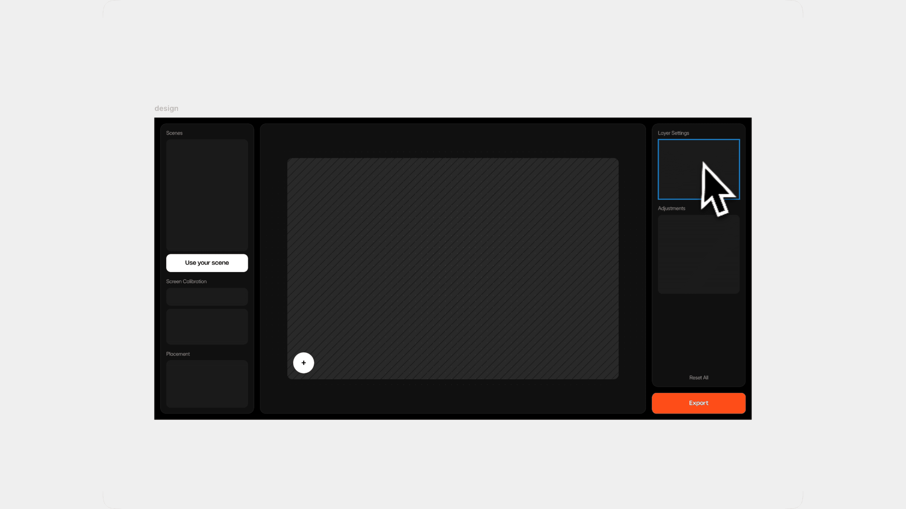
Then I gave Cursor specific design rules instead of just saying “make it look better.”
I defined things like:
layout structure
spacing
padding
button height
border radius
panel width
dark interface direction
export button styling
overall visual hierarchy
Here’s the design refinement prompt I used:
Prompt
Use the attached design preview as the final visual direction and refactor the app UI to match it closely. Important: preserve all existing working functionality. Do not rebuild the app from scratch if it breaks the current logic. Keep the screen calibration system, scene selection, design upload, placement controls, layer settings, and export behavior working. Core direction: The app should feel like a minimal premium mockup editor. The interface should be dark, clean, cinematic, and focused on the canvas. Avoid generic SaaS styling, unnecessary text, and visual clutter. Layout: - Full dark app on black background. - Three-column structure: 1. Left sidebar 2. Main canvas 3. Right sidebar - Outer app padding: 16px - Gap between panels: 16px - All panels should have: - 1px subtle border - 16px border radius - dark surface color - 16px inner padding - Keep the whole layout aligned horizontally like the reference. Left sidebar: - Width: around 250px - Section title: “Scenes” - Scene preview area at the top, large and visual. - Below it, keep the existing scene list / thumbnails, but make it fit the cleaner layout. - Add a “Screen Calibration” section. - Add a “Placement” section. - Use simple cards/blocks with 12px radius. - Section spacing: 24px. - Keep text minimal and low-contrast. - Do not add long helper text. Main canvas: - This is the visual focus. - Large central canvas panel. - The mockup scene/screen area should be centered both vertically and horizontally. - Canvas background should be very dark with a subtle dotted/grid texture. - The editable screen area should appear as a large rounded rectangle only when needed or as part of the current scene/screen region. - The canvas should not contain any instructional text. - Remove all helper copy like “Click + on the screen...” from the canvas. - Keep the scene clean and cinematic. Upload plus button: - Place the “+” upload button inside the editable screen area. - Position it near the bottom-left corner of the screen area, like in the reference. - Button size: 56px × 56px. - Fully circular. - White background. - Black plus icon. - Strong contrast. - Subtle shadow. - Cursor pointer. - The plus button must always stay inside the calibrated screenArea. - Clicking it opens the file picker. - After a design is uploaded, hide the plus button. - On hover, only the screen area may darken slightly. - Do not darken outside the calibrated screen area. - The hover overlay must be clipped exactly to the screenArea boundaries and border radius. Right sidebar: - Width: around 250px. - Top title: “Layer Settings”. - Keep existing layer controls here: - blend mode - opacity - brightness - contrast - saturation - reset layer - “Reset All” should be small and low-emphasis near the bottom of the panel. - Export button should sit below the right sidebar panel, aligned to its width. - Export button height: 56px. - Export button should be full width. - Export button color: strong orange/red accent. - Export button text: “Export”. - Export should be disabled until a design is uploaded, then become active. Component rules: - Main buttons: 56px height. - Inputs/selects: 48px height. - Small buttons: 40px height. - Icon buttons: 40px. - Upload plus button: 56px circle. - Card radius: 12px. - Panel radius: 16px. - Inner spacing: 16px. - Section gap: 24px. - Use subtle borders and low-contrast dividers. Typography: - Use a clean modern sans-serif. - Panel titles: 14px. - Section labels: 12px. - Button text: 14px medium. - Keep the text minimal, quiet, and premium. - Avoid large headings inside the app UI. Screen calibration: Keep the existing Screen Area Calibration / Edit Screen Area functionality. Do not remove or break: - Edit Screen Area mode - visible screen area overlay - draggable corner points / handles - live screen area adjustment - updated normalized coordinates - Copy coordinates button - scene-specific screenArea values - Fit / Fill behavior based on the calibrated screen area Calibration should feel integrated into the new left sidebar design. Calibration helpers should never appear in the exported PNG. Design placement: When a design is uploaded: - It appears inside the calibrated screen area. - It should use Fill by default so there are no empty white borders. - User can drag and reposition it. - User can resize from corners. - User can stretch from side handles. - User can use Fit, Fill, Reset, zoom controls if they already exist. - The design must stay clipped inside the screen area. - The preview and exported PNG must match exactly. Scene behavior: - Keep curated preset scenes as the core workflow. - Do not add custom scene upload yet. - The scene image / mockup area should stay as the main visual hero. - Scene thumbnails should be clean and visual, not generic device icons. - Selected scene should have a subtle accent outline/glow. Export: - Export should include the selected scene and the uploaded design exactly as shown. - Export should respect: - calibrated screenArea - position - scale - stretch - blend mode - opacity - brightness - contrast - saturation - Do not include UI controls, calibration outlines, handles, or plus button in the exported image. Final goal: Make the app match the attached minimal layout direction while keeping all current working functionality. The result should feel like a polished, premium mockup editor where designers can choose a curated scene, drop in their design, calibrate the screen area if needed, adjust placement/layer settings, and export a clean final mockup.
This helped a lot. The app started feeling less like a random generated interface and more like an actual design tool.
3. Small UI refinements
After the main layout was in place, I kept improving small details step by step. This is where most of the polish happened.
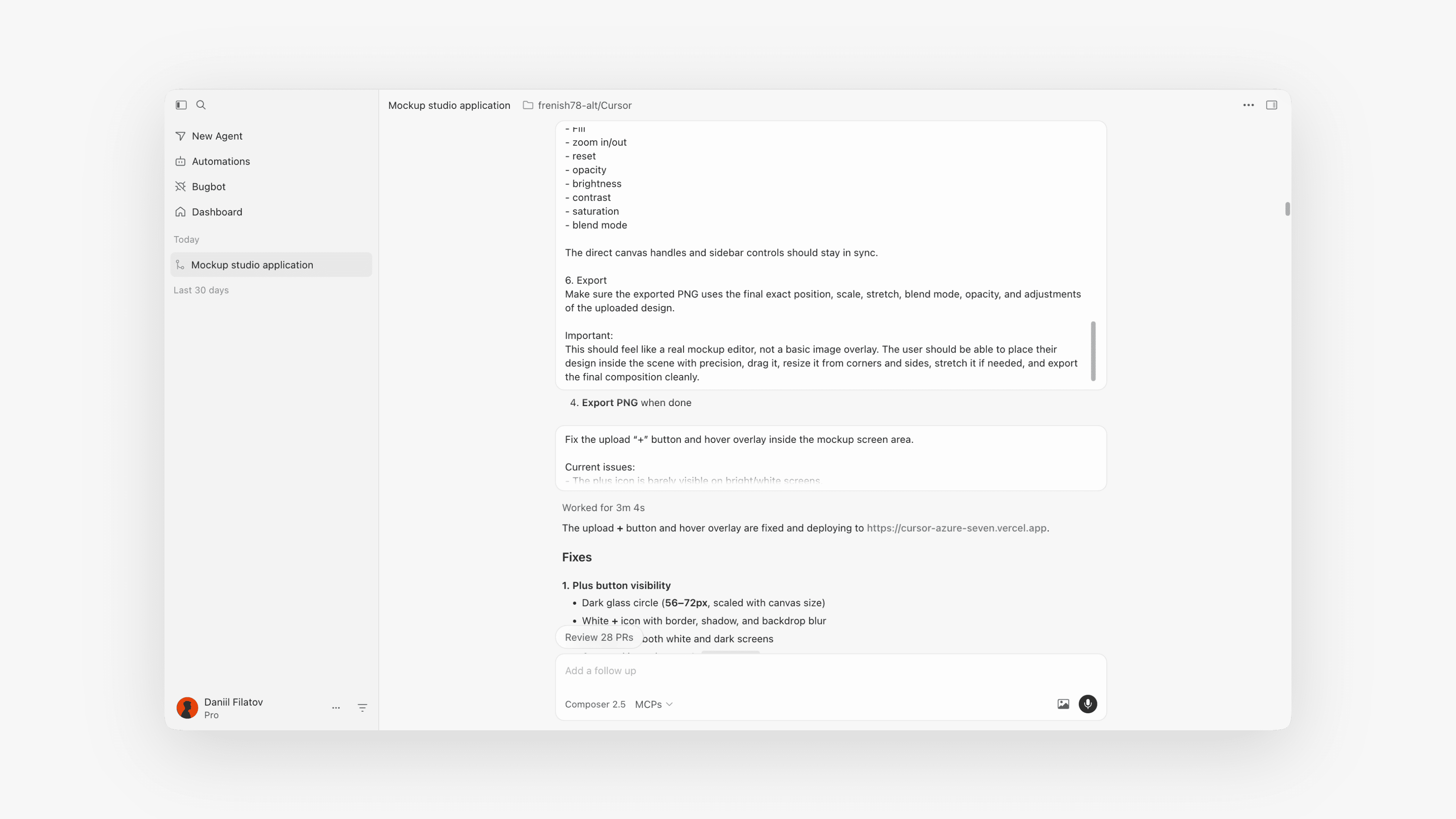
I refined things like:
cleaner sidebars
better placement controls
removing unnecessary containers
making the canvas feel more focused
improving button sizes
adding better spacing
cleaning up visual noise
improving export behavior
adding a perspective tool
adjusting the right-side settings panel
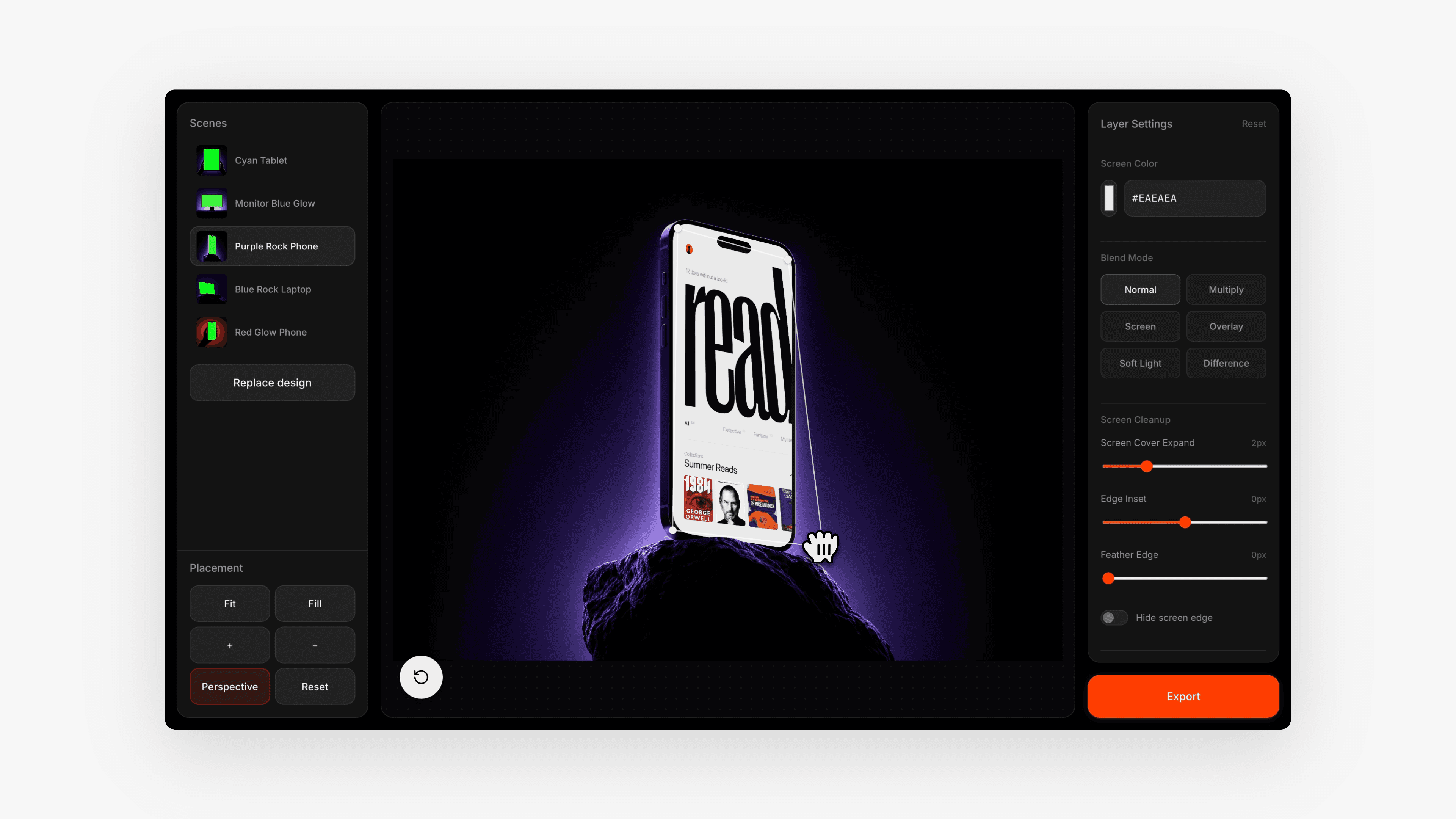
Prompt
Required UI fixes: 1. Hide the white scrollbar - The left sidebar currently shows a bright white native scrollbar, which breaks the dark premium UI. - Make the scrollbar invisible or style it to match the dark interface. - Prefer invisible scrollbar while keeping scrolling functional. - Apply this to all scrollable panels if needed. - No white/light browser default scrollbars should be visible anywhere in the app. 2. Fix Placement controls layout The Placement controls currently feel inconsistent. Update the layout: - Fit and Fill buttons should be in one row. - + and – buttons should also be in one row and have the same width as Fit and Fill. - Reset should be full width below. - All Placement buttons should use consistent height, radius, typography, and spacing. - Button height: 48px. - Gap between buttons: 12px. - Fit / Fill / + / – should each take 50% width of the row. - Reset should take 100% width. - Keep the whole Placement card clean and aligned. Example structure: Row 1: [ Fit ] [ Fill ] Row 2: [ + ] [ – ] Row 3: [ Reset ] 3. Add screen background color option In the adjustment / layer settings panel, add a new control called “Screen Background”. This should let the user choose what the empty screen/background looks like before or behind the uploaded design. Options: - White - Black Behavior: - White should keep the current white screen background. - Black should make the screen area black. - This should be useful when the uploaded design has transparency or does not fully cover the screen. - The selected screen background color should be visible in the canvas preview. - The exported PNG should include the selected screen background color. - Place this control in the Layer Settings / Design Layer panel near opacity and blend mode controls. 4. Update accent color Use this exact orange accent color across the app: #FF3C00 Apply it to: - Export button - active/primary states where orange is used - important CTA states Do not overuse it. Keep the rest of the UI dark and minimal. 5. Keep existing functionality Do not remove or break: - Scene selection - Design upload - Replace design - Screen calibration / Edit Screen Area - Show Area toggle - Fit / Fill / zoom controls - Drag and resize placement - Blend modes - Opacity, brightness, contrast, saturation - Export Final goal: The UI should feel cleaner, more unified, and more premium. No visible white scrollbars, consistent Placement controls, a useful White/Black screen background option, and the orange accent should be exactly #FF3C00.
This was one of the most important steps, because the app stopped feeling like a webpage and started feeling like an interactive object.
What I learned
The biggest lesson is that building with AI tools feels very similar to product design.
You don’t get the perfect result from one prompt.
You start rough, test fast, and refine step by step.
The process that worked best for me was:
Build the core functionality first.
Replace generic parts with your own assets.
Use a visual reference for the design.
Give specific requirements.
Fix one thing at a time.
Keep testing the actual experience.
Polish only after the basic flow works.
The most important thing is to avoid vague feedback.
Instead of saying:
“Make it better.”
Say:
“Make the export button 56px high, full width, orange #FF3C00, and disabled until a design is uploaded.”
That level of detail helps Cursor much more.
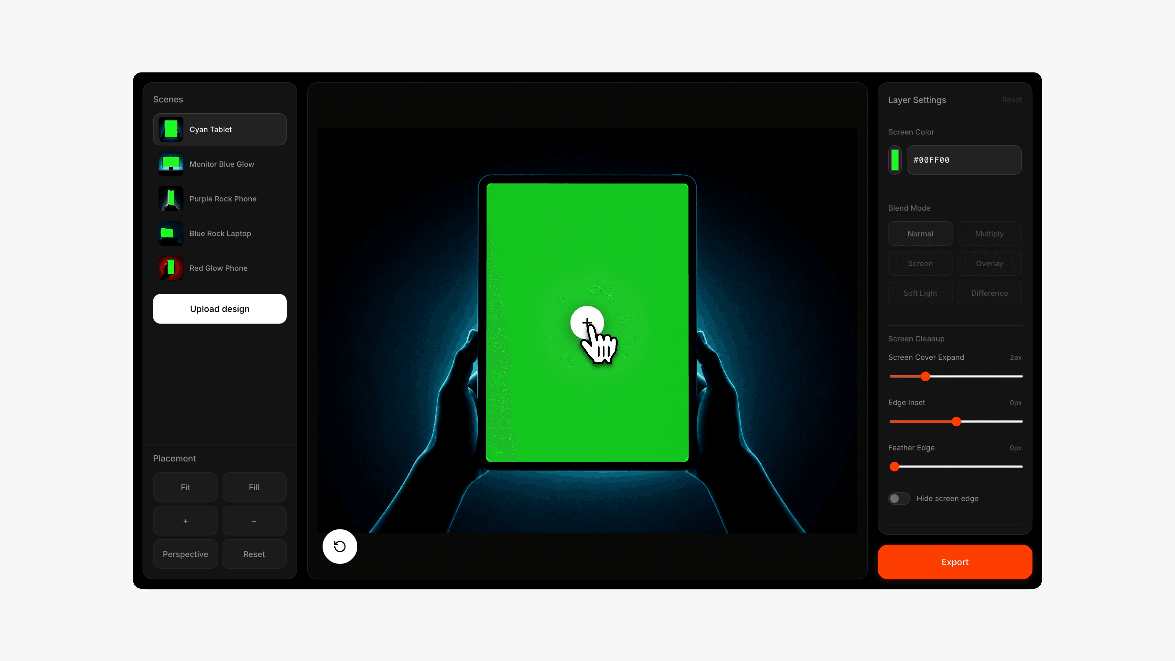
Final thought
This started as one static AI-generated image. With Cursor, I turned it into a working browser tool that anyone can use.
That’s what feels exciting to me. We’re not just generating visuals anymore. We can turn those visuals into real products.
Try the mockup tool:
the platform
Each collection is built around a distinct visual language, with reusable prompts, templates, and notes that help you customize fast.